Urban Summit
Overview
Urban Summit was designed to provide a way for solo adventurers to feel comfortable enjoying the outdoors alone or in small groups. Being on a team of three woman-identifying designers, this app creation was inspired by the increase in violence against women. However, the overarching goal of this app is to help all people feel safe while they are exercising alone outside with or without the cell signal, and provide further guidance when they need help.
Contributions
Role: One of three UX Designers in a shared project
Responsibilities: Mid and hi-fi interface design (map screens), usability testing, and analysis and design recommendations
Duration:September 2021 - November 2021
Tools: Figma, Axure, Photoshop
Conceptualization
Lo-Fi Sketching
After coming up with our initial vision for the project, we each produced lo-fi sketches of main features.
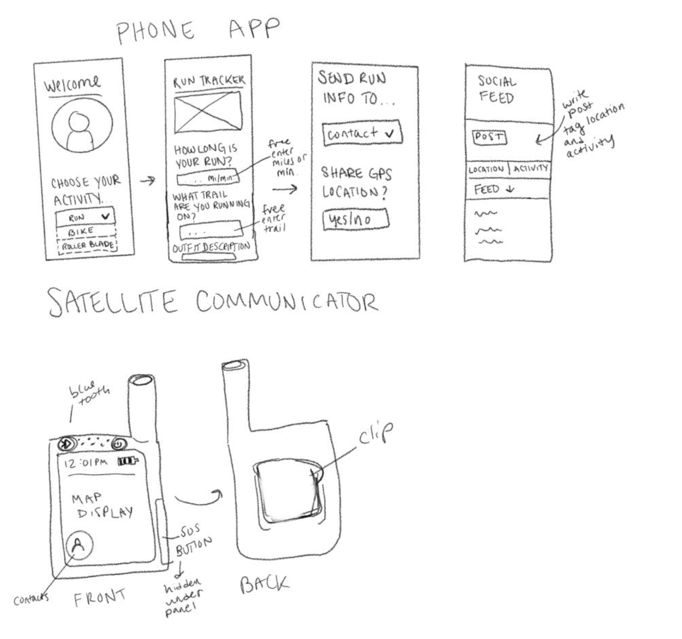
Main Features
- Document your activity and your destination. In addition, provide description in case rescue is needed
- Share location with others
- Engage in social posting and read other’s posts about specific locations and activities
- Portable/wearable communicator design
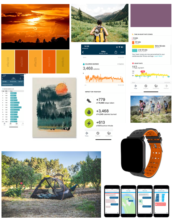
Mood Board
Next, we created a mood board to collaboratively view our vision for the Urban Summit product. This mood board included inspiration from existing smartwatch and satellite GPS locators as well as color palettes, and ways of displaying features.

Logo
We designed the logo shown to help us visualize the goals of the Urban Summit product. This logo is intended to represent users who explore wild spaces and places outside of cities (who may benefit from satellite communication), as well as users who live in the city and want a way to feel safe.
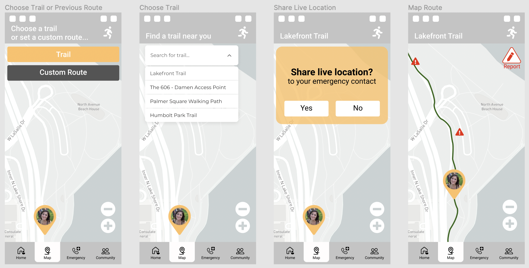
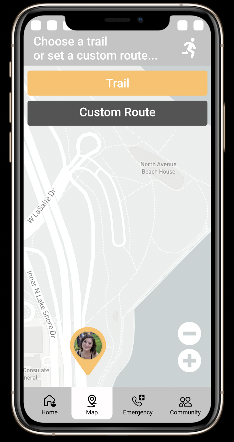
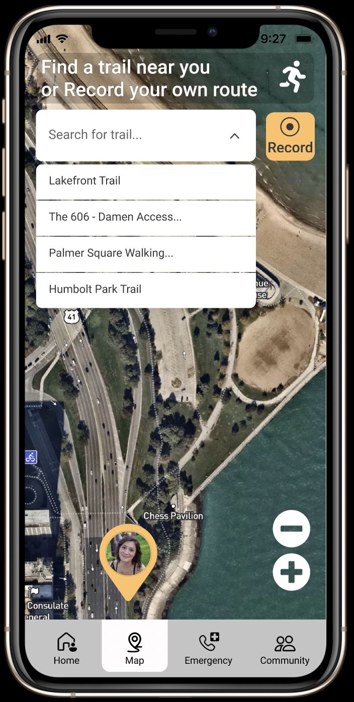
Mid-Fi: Wireframes and Prototyping
We used Figma to collaboratively design a prototype for Urban Summit. We wanted to develop something that presented our main idea and features in a testable format to gather user feedback.
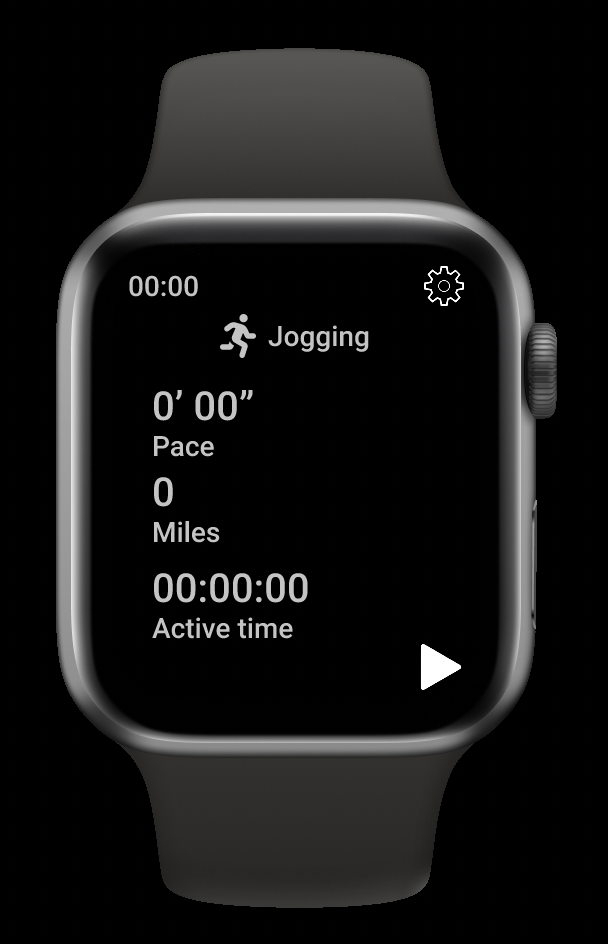
Watch
Phone
Usability Testing
We prefaced usability testing by running a pilot test among ourselves. After the pilot test was performed, we conducted usability tests with 4 users. Most of our tests were conducted via videoconferencing platforms. Users were tasked with completing several scenarios using the Mid-Fi prototype for watch and phone. Test moderators observed how long users took to complete each task, and recorded user's attitudes towards the prototypes. After completing these tasks, users were asked to answer a few questions to assess perceived challenges.
The test script was used by all monitors for consistency. You can view the test script here: View Test Script
Results
Home Screen
Many users were confused with the layout of the homescreen/landing page. All users didn't understand the "start new activity" button and all users were confused about how to add an emergency contact.
Map
One user was confused about the search methods used for finding a trail on the map. This user reported being more familiar with using a search box to find a trail, and wasn't sure why they needed to tap "trail" before searching.
Emergency
Three users struggled to find the screen displaying ambulance location. Two users clicked the ambulance icon directly, expecting to find the location there. One user expected to find the ambulance within the community page. Two users failed to find the ambulance location entirely, and terminated the task.
Satellite Mode
Three users struggled to contact family according to the task - two users eventually completed the task, the other user asked to terminate the task before completing it, due to frustration.
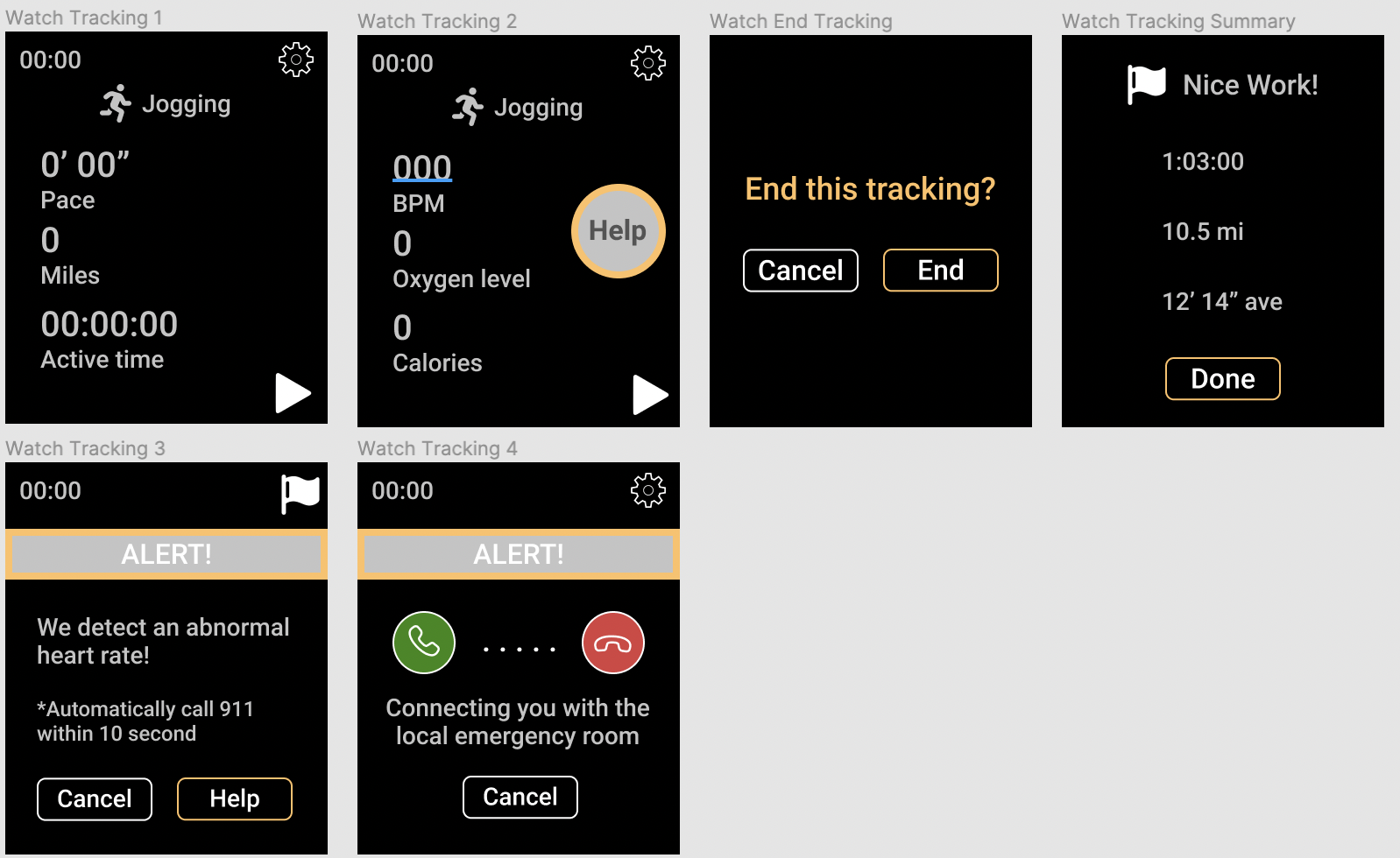
Watch
Three users were confused about the phone icons when calling 911, and the interaction of hanging up. Additionally, two users thought that the "help" rectangle signified tech support. Two users commented that it seemed inappropriate for the watch to display "Nice work!", after the exercise session was ended due to an emergency.
Recommendations
The following recommendations were made based on issues that users experienced and reported during the usability tests. These recommendations informed the subsequent design of our hi-fi prototype.
Home
- Change “start new activity” to “enter activity info”
- Seperate the emergency contact from the tracking the activity and simplify the process of inputting information
- Create more distinction between emergency contact and Emergency feature in the main menu
Map
- Merge the custom route function into the searching box
Emergency
- Change “the Help is on the way” message to “check ambulance location”.
- Delete the “confirming arrival” function
- Indicate the calling 911 function clearly by green phone icon and only keep the hang up button during the call
- Further design the function of report injury
Satellite Mode
- Add top bar to switch between different conversations
- Delete the “confirming arrival” function
Watch
- Only keep the hang up button during the call
- Change the rectangle help button to be consistent to the circle one
- End the tracking automatically under emergency situation
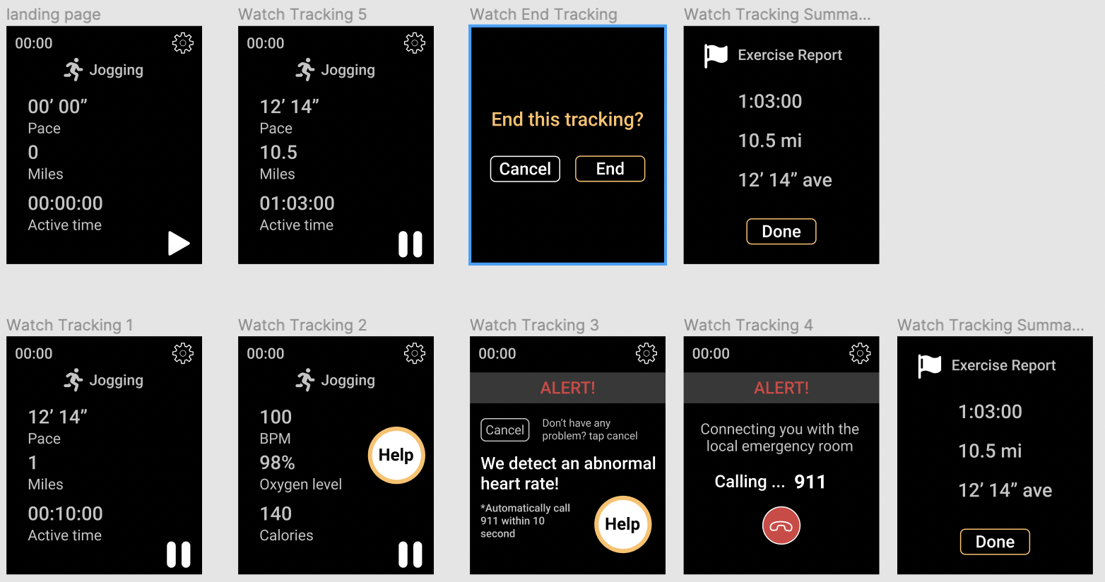
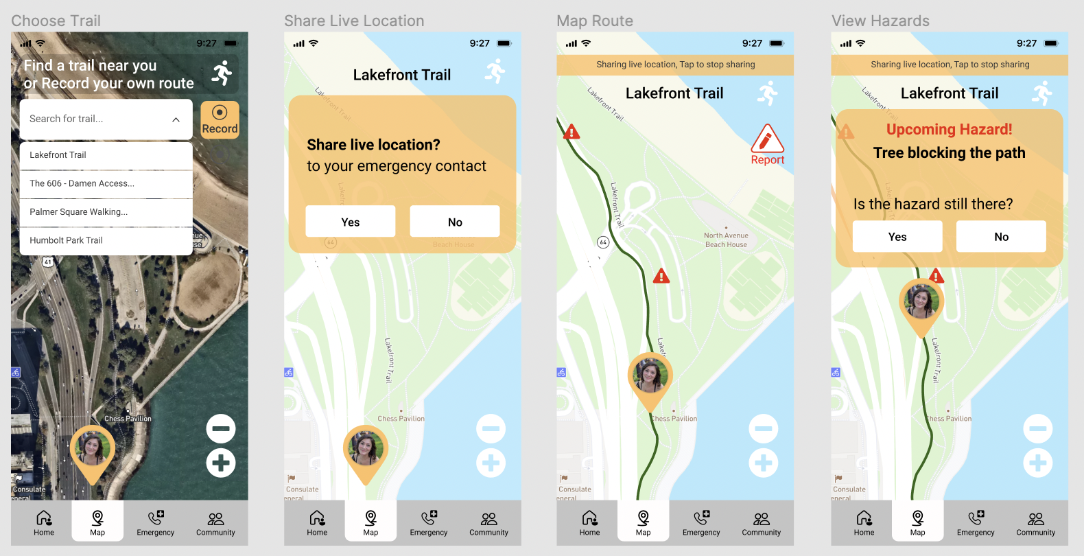
Hi-Fi Prototype
The hi-fi prototype was created to visually solidify our interface themes, such as icons and typography. In addition, interactions were modified according to feedback received in the usability tests.
Watch
Phone
Reflections
This project was as much an exercise in prototyping as it was teambuilding. As a group, we learned to roll with each other's strengths, and step in to fortify weaknesses. We took turns pitching ideas, tested them in our mid-fi prototype, and used the results and feedback from our users to make improvements. My major takeaway was to pay attention to details and icon use, as improper placement can be confusing. This was seen in the confusion users had regarding the ambulance icon - as clicking it did not lead to finding the ambulance location.
Lastly, as a team, we should have spent more time gathering insights earlier in the prototyping process - with lo-fi basic models. This would have allowed us to change things easier, before committing to design elements, and needing to rework an entire interface.